CITY/STATE: Some Legitimately Good Economic News For Rhode Island
Monday, July 01, 2013
The Bureau of Economic Analysis recently released personal income figures that reflect the different costs of living – or what they call “regional purchasing power” in states and metro areas. These paint a much better picture of New England and Providence than some other surveys do.

When it comes to the economic health of a community, there are two key statistical areas that loom large, jobs and incomes. Jobs is a pretty straightforward one. It’s a simple matter of how many there are versus how many want one, with a few caveats like underemployment or part time work.

Incomes are trickier though because a job is a job statistically, incomes vary in what they will purchase in different parts of the country because of the cost of living. This can make comparing incomes across regions difficult. For example, incomes are high in California, but so is the cost of living.
GET THE LATEST BREAKING NEWS HERE -- SIGN UP FOR GOLOCAL FREE DAILY EBLASTThe BEA data helps with this. Looking at it, here’s how the states stack up on purchasing power with the US average set by definition to 100. Higher numbers mean lower purchasing power (since you divide incomes by this value). So in a sense high numbers are bad.

State Regional Purchasing Power Index, 2011. Source: US Bureau of Economic Analysis. Map via telestrian.com.
As you can see, the Northeast is one of the pricier regions. However, this BEA purchasing power index measure does not show the extreme variation that some other common but proprietary measures do. Rhode Island is only at 100.5, slightly higher than the US average. Connecticut is 110.1, Massachusetts 107.3, New Hampshire 105.2, Vermont 100.0, and Maine 97.4.
Unsurprisingly then, New England per capita personal incomes adjusted for purchasing power parity look reasonable good. Here’s the national map:

State Real Per Capita Personal Income, 2001, thousands of dollars (Adjusted for inflation in 2005 dollars and for regional purchasing power). Source: US Bureau of Economic Analysis. Map via telestrian.com.
Rhode Island actually ranks #16 in America according to this report, at $38,400/year – a very respectable showing that even slightly bests low tax New Hampshire. Connecticut is at $46,200 (#3), Massachusetts is at $43,800 (#6), New Hampshire $38,300 (#17), Vermont $36,500 (#26), and Maine $34,600 (#33) to round out New England.
On a metro area basis, Providence has a regional purchasing power index of 100.5, the same as the state of Rhode Island as a whole, which should not be a surprise. This is the 18th highest out of the 51 metro areas with more than a million people. At 110.5, Boston ranks #7 in America among large metros. NYC is #1 at an index of 120.5. Worcester is at 104.9, which ranks 29th out of all 366 metro areas. The most expensive metro in America is actually Bridgeport-Stamford-Norwalk, CT near New York with an index of 122.3.
Here’s the purchasing power map of US metros:

Metro Area Regional Purchasing Power Index, 2011. Source: US Bureau of Economic Analysis. Map via telestrian.com.
And here is how that translates into adjusted personal incomes:
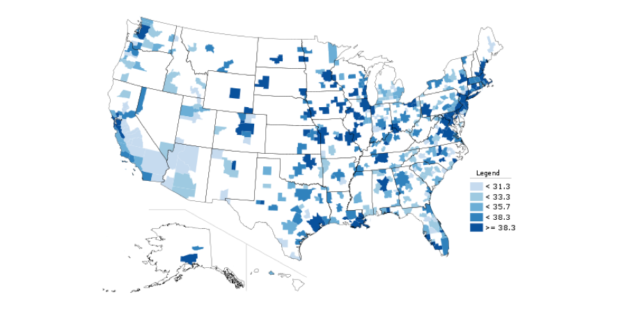
Metro Area Real Per Capita Personal Income, 2001, thousands of dollars (Adjusted for inflation in 2005 dollars and for regional purchasing power). Source: US Bureau of Economic Analysis. Map via telestrian.com.
Providence ranks in the middle of the pack here. It’s adjusted per capita persona income is $37,800/year, ranking 26 out of 51 large metros. That’s much better than some other surveys I’ve seen, presumably because of the lower purchasing power adjustment in these BEA numbers. Despite its high cost of living, Boston remains a powerhouse in incomes, at $46,000/year – second in the nation and even outstripping the Bay Area. Hartford, CT is #1 at $46,200. Expanding the field to look at all metros, Worcester is at $38,100, ranking 79 out of 366.
All in all, this survey is more kind to Providence and New England that some others I’ve seen. This data is being released on what has been termed a “prototype” basis for public comment, so we will see how it evolves. But as I always urge communities not to sugar coat or explain away bad news, we should enjoy the legitimate good news (or at least better news) in the form of official government data, when it comes.
Aaron M. Renn an opinion-leading urban affairs analyst, entrepreneur, speaker, and writer on a mission to help America’s cities thrive in the 21st century. In his blog, The Urbanophile, he has created America’s premier destination for serious, in depth, non-partisan, and non-dogmatic analysis and discussion of the issues facing America’s cities and regions in the 21st century. Renn’s writings have also appeared in publications such as Forbes, the New York Times, and City Journal. Renn is also the founder and CEO of Telestrian, a data analysis platform that provides powerful data mining and visualization capabilities previously only available in very expensive, difficult to use tools at a fraction of the cost and with far superior ease of use.
Related Articles
- CITY/STATE: How White Providence Really Is
- CITY/STATE: Providence By The Numbers—The Good + The Bad
- CITY/STATE: Rhode Island’s Problem Isn’t Poor Leadership
- CITY/STATE: Some Legitimately Good Economic News For Rhode Island
- CITY/STATE: Three Economic Big Ideas For Rhode Island
- CITY/STATE: What Makes A Great Community?
- CITY/STATE: Who’s Coming + Going—Surprising RI Migration Data